
Table of Contents
On my internet travels this past week, I came across a website that had a quirky menu effect – meaning that when I hovered over each menu item, the bottom border would ‘follow’ me to the next menu item.
Now, this kind of technique isn’t exactly new – I have seen quite a few of these menus in my time but I have never really dug into how they work exactly, and this website that I was browsing inspired me to create my own version (Sorry, I have completely forgotten what the website was called but the idea is like the following).
So without further ado, let’s build this navigation menu with animated indicator.
1. Initial Setup of HTML, CSS, and JavaScript Files
Let us setup the boilerplate pages.
- index.htm
- style.css
- main.js
<!doctype html>
<html lang="en">

   <head>

      <meta charset="UTF-8">
      <title>Demo: Slick Menu Indicator | Frontend Hero</title>
      <meta name="viewport" content="width=device-width, initial-scale=1.0">
      <meta http-equiv="X-UA-Compatible" content="IE=edge,chrome=1">

      <link rel="shortcut icon" href="https://www.frontendhero.dev/wp-content/themes/feh-v1/favicon.png" type="image/x-icon">
      <link rel="stylesheet" id="uniform-css" href="https://www.frontendhero.dev/wp-content/themes/feh-v1/fonts/fonts.css" type="text/css" media="all">

      <!-- Required -->
      <link rel="stylesheet" href="https://cdnjs.cloudflare.com/ajax/libs/font-awesome/4.7.0/css/font-awesome.css">
      <link rel="stylesheet" type="text/css" href="style.css">
      <!-- / Required -->

   </head>

   <body>

      <!--
      Header code
      -->

      <div id="nav-wrapper"></div>

      <script src="main.js"></script>

   </body>
</html>
/**
* Quick and dirty reset & wrapper set-up
*/
* { padding: 0; margin: 0; box-sizing: border-box; }
html, body { height: 100%; font-family: uniform; }
.wrapper {
position: relative;
width: 100%;
max-width: 1100px;
margin: 0 auto;
padding: 0 15px;
}
/**
* Header (You won't need this)
*/
#primary-header {
background: #eee;
padding: 35px 0px;
}
.logo {
height: 45px;
display: block;
}// coming soonNotes
- So, we have created a HTML page, linked up two CSS files, and a JavaScript file.
- I’ve included a quick CSS reset block, and wrapper in the
style.cssfile. - We are using the awesome (older 4.7 version) of Font Awesome for our icons.
2. Create our Navigation Menu
Now let’s create a HTML navigation menu now.
- index.htm
- Result
<div id="nav-wrapper">
   <nav id="nav-primary">
      <ul>
         <li>
            <a href="#">
               <i class="fa feh-icon fa-home"></i>
               <span class="li-name">Home</span>
               <i class="fa feh-icon-bg fa-home"></i>
            </a>
         </li>
      </ul>
   </nav>
</div>
Notes
- I’ve created a
#nav-wrapperdiv that will be the container for our navigation menu. - Then I’ve added a simple
navelement to hold our menu and menu items. - Inside our anchor element, I’ve enclosed the menu item name in a
<span>element with a class of.li-name. I’ved used a<span>tag here because it’s easier to position the menu item where we will want to a bit later on. - Lastly here, I’ve created two
<i>elements that will utilise the Font Awesome library to display icons. In the above example, I have created a home icon for the first menu item<i class="fa feh-icon fa-home"></i>.
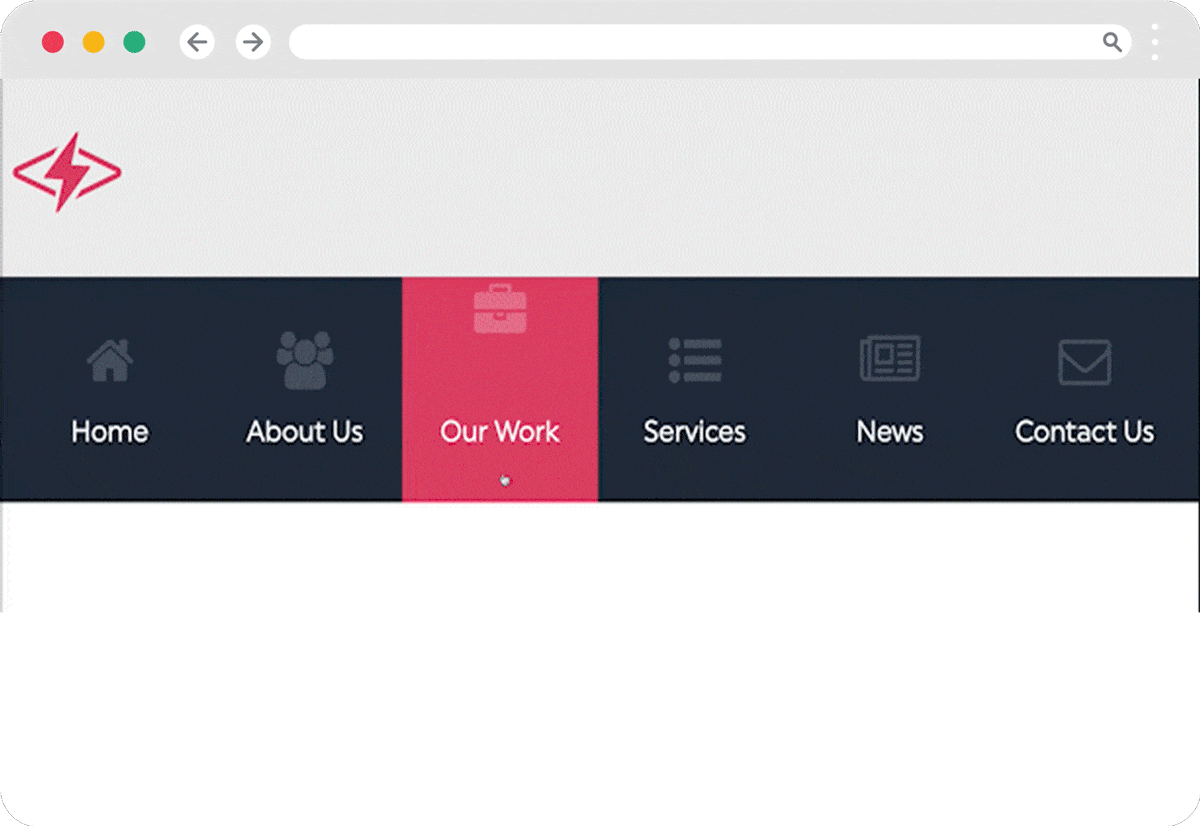
Then we just need to duplicate this home menu icon five more times to create our full navigation menu.
I’ve created a typical list of menu items that most websites use, accompanied with their (somewhat) related Font awesome icon.
- Home
- About us
- Our work
- Services
- News
- Contact
- index.htm
- Result
<div id="nav-wrapper">
   <nav id="nav-primary">
      <ul>
         <li>
            <a href="#">
            <i class="fa feh-icon fa-home"></i>
            <span class="li-name">Home</span>
            <i class="fa feh-icon-bg fa-home"></i>
            </a>
         </li>
         <li>
            <a href="#">
            <i class="fa feh-icon fa-users"></i>
            <span class="li-name">About Us</span>
            <i class="fa feh-icon-bg fa-users"></i>
            </a>
         </li>
         <li>
            <a href="#">
            <i class="fa feh-icon fa-briefcase"></i>
            <span class="li-name">Our Work</span>
            <i class="fa feh-icon-bg fa-briefcase"></i>
            </a>
         </li>
         <li>
            <a href="#">
            <i class="fa feh-icon fa-list-ul"></i>
            <span class="li-name">Services</span>
            <i class="fa feh-icon-bg fa-list-ul"></i>
            </a>
         </li>
         <li>
            <a href="#">
            <i class="fa feh-icon fa-newspaper-o"></i>
            <span class="li-name">News</span>
            <i class="fa feh-icon-bg fa-newspaper-o"></i>
            </a>
         </li>
         <li>
            <a href="#">
            <i class="fa feh-icon fa-envelope-o"></i>
            <span class="li-name">Contact Us</span>
            <i class="fa feh-icon-bg fa-envelope-o"></i>
            </a>
         </li>
      </ul>
   </nav>
</div>
Now that we have the bones of the menu created, we need to make it pretty. Let’s grab our paintbrush and style things up!
3. Styling Our Navigation Menu With Indicator
I’m going to make the background colour of the #nav-wrapper a dark blue colour that will extend the width of the browser window but I want the actual menu to be centered in the middle of our page, and constrained to the width of our .wrapper class, in the style.css.
So to achieve this, all I have to do is add the .wrapper class to our <nav> element and voila!
- index.htm
- style.css
- Result
...

<div id="nav-wrapper">
   <nav id="nav-primary" class="wrapper">

      ...
#nav-wrapper {
background-color: #222e42;
height: 125px;
}
#nav-primary ul {
display: flex;
}

The above should be pretty straight forward, so I won’t go into detail here but I will explain the next section.
3.1. Tweak Colours, Remove List Style & Underline
Here I will clean things up a bit by removing default browser styling, give the list items a height and center text etc.
Explanations of each line in the comments below.
- style.css
- Result
   #nav-primary li {
      list-style: none;          /* remove default browser bullet styles */
      flex-grow: 1;              /* This will evenly distribute each list item */
      text-align: center;        /* center align text */
      height: 125px;             /* make the height of each list item 125px */
      font-size: 16px;           /* make the font 16px in size */
   }
      #nav-primary a {
         display: block;         /* Expand anchor area to fill space to the parent list item's area (making hover area larger) */
         height: 100%;           /* Make the anchor element 100% in height of its parent, or 125px in height */
         text-decoration: none;  /* remove default browser underline styling for anchor elements */
         color: #fff;            /* make text white */
         position: relative;     /* Inner elements will be absolute positioned to this relative element */
      }
3.2. Positioning the List Item Names
Now we need to position the icons and menu title.
I’ll start positioning with the title .li-name. and comment below how each line works.
- style.css
- Result
.li-name {
   position: absolute;  /* position absolute of parent element */
   left: 0;             /* position text to the very left of parent */
   bottom: 30px;        /* position text 30px from bottom of parent element */
   width: 100%;         /* make text 100% of parent (as we are already centering text in a parent #nav-primary li, this title will be nicely centered  */
}

Our text is aligned, awesomesauce, now we have to give some love to the icons.
3.3. Positioning the Icon Above the Text
I’ll start by positioning the icon above the text and making it a little larger, and then tweaking the opacity to bring he brightness down a bit.
- style.css
- Result
.feh-icon {
   opacity: 0.2;                 /* make icon less prominent */
   transition: all 0.3s ease;    /* as we will be animating this, we need to add a transition declaration */
   font-size: 32px;              /* increase the icon */
   position: absolute;           /* position the icon absolutely to the parent element */
   transform: translateX(-50%);  /* center align icon, horizontally */
   left: 50%;                    /* center align icon, used in conjunction with the translateX(-50%) value  */
   top: 30px;                    /* align icon 30px from the top of the parent element */
}
Looking good but we still have to sort the remaining icon at the top that will become the background icon.
3.3. Positioning and Scaling the Background Icon
All that’s left here is to position the background icon and scale it down so it’s hidden from view, until later when we will animate it.
- style.css
- Result
.feh-icon-bg {
   position: absolute;                         /* position the icon absolutely to the parent element */
   transform: translate(-50%, -50%) scale(0);  /* first we center align the icon, then we scale it down to 0, making it invisible */
   top: 50%;                                   /* center align icon (vertically), used in conjunction with the translate(-50%, -50%) value */
   left: 50%;                                  /* center align icon (horizontally), used in conjunction with the translate(-50%, -50%) value */
   font-size: 70px;                            /* Make the icon larger */
   opacity: 0.2;                               /* bring the white icon down in opacity as it will only be used for the background aesthetic */
}
That looks good to me – now all of our menu items in our navigation menu iare nicely styled.
4. Styling the Menu Background Indicator
Here we’ll create the #indicator that will eventually be dynamic, but first we need to create the element and style it.
4.1. Creating the Indicator Item & Styling It
Let’s first create a new HTML element called #indicator. Then style it up to have a hover / active state, paired with a different background color.
- index.htm
- style.css
- Result
<nav id="nav-primary" class="wrapper">
   ...
      <li id="indicator"></li>

      ...
#indicator {
position: absolute; /* position the icon absolutely to the parent element */
width: 100%; /* to see how this element will look, I'm setting the width as 100% for illustrative purposes - please change this back to 0 */
height: 100%; /* 100% height of our parent element */
background: #dd466c; /* pink background */
top: 0; /* aligning to the top of parent element */
left: 0 /* aligning to the left of parent element */
transition: all 0.3s ease; /* as we will be animating this, we need to add a transition declaration */
}
What we’re left with is above in the Result tab – a pink #indicator background that is 100% width of the parent element <ul>. As commented above, I’ve made the width of this #indicator to be 100% of the parent element only to show you how it is styled. Going forward, this width will be 0, making it hidden.
5. Animating the Menu Indicator on Hover
We’re now ready to move on to the fun stuff and make the background indicator interactive and mooooove.
The idea is pretty simple, when a user hovers over a menu item, we want the dynamic indicator to move to this hovered item, changing its width to that of the hovered item’s width.
5.1. Declare Our Variables
I’m going to now declare all of the variables that we’ll be using throughout the course of this tutorial, but for the moment all we need to concentrate on are the first two:
activeListItemlistItems
- main.js
const activeListItem = document.getElementById('indicator');     // get the sliding indicator element
const listItems = document.querySelectorAll('#nav-primary li');  // get all the list items in the menu

/**
* Used later
*/
const navPrimary = document.getElementById('nav-primary');       // get the navigation container element
let activeIndex = null;                                          // more on this later
5.2. Create Our Animated Indicator Function
Here I’ve created the guts of the project, a simple function that will take a parameter (list item), and then animate the position and width of our indicator to the target’s position and expand to its width.
- main.js
function indicator(e) {
   activeListItem.style.left = e.offsetLeft + 'px';
   activeListItem.style.width = e.offsetWidth + 'px';
}
5.3. Executing Our Indicator Function
Our indicator function is great and all, but we have to integrate it into our script for it to run.
Below I’m going to loop over all menu items listItems of the #nav-primary menu that we created in a previous step, and then if a user hovers over a menu item, we’ll execute the indicator function.
- main.js
- Result
listItems.forEach((listItem) => {
   listItem.addEventListener('mouseenter', () => {
      indicator(listItem);
   });
});
We could leave it there and call it a day, but as per my demo, I’ve added a few little bells and whistles to enhance the menu. You can either call it a day here, or carry on for extra brownie points. 🙌🏻
6. Animating the Icons
We have two icons, one above the text and one scaled down to 0, so is hidden from view. We need to animate these two icons in different ways. I will begin with the visible icon first.
6.1. Create the Keyframes to Animate the Main Icon
Here we need to create two @keyframes rules:
navIconHoverInnavIconHoverOut
These keyframes rules will move our icon out of view when a user is hovering over our menu item, and then back into view when a user has hovered away.
- style.css
@keyframes navIconHoverIn {
   0% {
      top: 30px;
   }
   50% {
      top: -50px;
   }
   100% {
      top: 30px;
      opacity: 1;
   }
}

@keyframes navIconHoverOut {
   0% {
      top: 30px;
      opacity: 1;
   }
   50% {
      opacity: 1;
   }
   100% {

   }
}
Notes
- 0% (initial state): The element’s
topposition is set to 30px (The current value). This means that at the beginning of the animation, the element will be positioned 30 pixels from the top of its relative container. - 50% (middle state): The element’s
topposition is set to -50px. This means that at the midpoint of the animation, the element will be positioned 50 pixels above the top edge of its relative container. - 100% (final state): The element’s
topposition is set to 30px, which is the same as the initial state. Additionally, theopacityis set to 1, ensuring that the element is fully visible by the end of the animation.
6.2. Linking Up Our Keyframes For Our Main Icon
All we have to do now is link up our keyframes to animate our icon.
Please note that in the Result tab, I have slowed the speed of the animations down to a few seconds to illustrate how they work.
- style.css
- Result
#nav-primary li:hover .feh-icon {
   animation-name: navIconHoverIn;
   animation-timing-function: ease-in-out;
   animation-fill-mode: forwards;
   animation-duration: 275ms;
   animation-delay: 155ms;
}
#nav-primary li:not(:hover) .feh-icon {
   animation-name: navIconHoverOut;
   animation-timing-function: ease-in-out;
   animation-fill-mode: backwards;
   animation-duration: 225ms;
   animation-delay: 100ms;
}
Notes
- The following animation properties are set for the
#nav-primary li:hover .feh-iconselector:animation-name: The name of the keyframes used for the animation. In this case, it isnavIconHoverIn.animation-timing-function: Describes how the animation progresses over time.ease-in-outmeans the animation starts slowly, accelerates in the middle, and slows down again towards the end.animation-fill-mode: Specifies how the styles are applied before and after the animation.forwardsmeans the styles defined in the last keyframe are retained after the animation ends.animation-duration: The duration of the animation, which is 275 milliseconds in this case.animation-delay: The time before the animation starts, which is 155 milliseconds here.
#nav-primary li:not(:hover) .feh-icon– This selector targets the.feh-iconelement that is a child of anlielement when thelielement is NOT being hovered over. The:not()pseudo-class is used to achieve this.#nav-primary li:not(:hover) .feh-iconfollows the same format as above, with our other keyframes animationnavIconHoverOutand tweaked timings.
6.3. Create the Keyframes to Animate the Background Icon
We’ve got our main icon animating nicely, now it’s time to animate the background icon into view.
- style.css
@keyframes navIconBGHoverIn {
   0% {
      transform: translate(-50%, -50%) scale(0);
      opacity: 0;
   }
   100% {
      transform: translate(-50%, -50%) scale(2) rotate(45deg);
      opacity: 0.2;
   }
}

@keyframes navIconBGHoverOut {
   0% {
      transform: translate(-50%, -50%) scale(2) rotate(45deg);
      opacity: 0.2;
    }
   100% {
      transform: translate(-50%, -50%) scale(0) rotate(0deg);
      opacity: 0;
   }
}
Notes
- In our two keyframes, we’re keeping the icon center, as per our original CSS rule
transform: translate(-50%, -50%), and then scaling the icon to come into view from 0 to 2, or two times the size of the icon (70px), which will go from 0px to 140px. - Then we’re just smoothing the fading in and out by changing the opacity.
6.4. Linking Up Our Keyframes For Our Main Icon
With the keyframes made in the previous step, we will now link them up. This step is basically the same as to when we animated our main icon earlier, with some tweaked timings.
- style.css
#nav-primary li:hover .feh-icon-bg {
   animation-name: navIconBGHoverIn;
   animation-timing-function: ease-in-out;
   animation-fill-mode: forwards;
   animation-duration: 225ms;
   animation-delay: 175ms;
}
#nav-primary li:not(:hover) .feh-icon-bg {
   animation-name: navIconBGHoverOut;
   animation-timing-function: ease-in-out;
   animation-fill-mode: backwards;
   animation-duration: 150ms;
   animation-delay: 125ms;
}
Our menu with animated indicator is looking pretty sleek now, but you might have noticed that our icons are visible outside the indicator background, and it looks messy. Let’s fix that.

6.5. Fixing the Icon Overflow Issue
We need to revisit the #nav-primary a element and add a new rule to our anchor elements.
What we’re telling the browser is anything that overflows the boundaries of the <a> element will be hidden and won’t be visible on the page.
- style.css
- Result
#nav-primary a {

   ...

   overflow: hidden;
}
Better, much better!
7. Accommodating an Active State Menu Item
I’m pretty happy with our little menu, but there is an issue present. What if we wanted one of these menu items to be in an active state, maybe to show the user what page they’re currently on?
Let’s accommodate this feature.
7.1. Getting Index of Potential Active Menu Class
I would also like the indicator to fade in if an active class is found, instead of sliding into view, so I will create some CSS to achieve this also.
- index.htm
- style.css
- main.js
<nav id="nav-primary" class="wrapper">

   ...

      <li class="active"> /* first menu - home */

...
.fade-out {
opacity: 0;
}
.fade-in {
opacity: 1;
}listItems.forEach((listItem, index) => {
...
if (listItem.classList.contains('active'))
{
activeIndex = index;
}
});Notes
- First, we’ve added a class of active to the home menu item.
- The in our CSS file, I have created two new classes that will fade in (and fade out).
- Then we revisit our
listItemsforEachloop, add in an index parameter to get the current index of the menu items. - Then we check if any menu item contains an active class, if so – we add that index number to the variable that we created earlier –
activeIndex. The first index is home, and that is1.
7.2. Fading in Our Indicator if an Active Menu Item Is Found
Here is where I will be fading in our indicator depending on whether a menu item contains an active class.
- main.js
if (activeIndex !== null) {
   activeListItem.classList.add("fade-out");

   setTimeout(function()
   {
      activeListItem.style.width = listItems[activeIndex].offsetWidth + 'px';
      activeListItem.style.left = listItems[activeIndex].offsetLeft + 'px';
}, 200);

   setTimeout(function()
   {
      activeListItem.classList.remove("fade-out");
      activeListItem.classList.add("fade-in");
   }, 600);
}
Notes
- The above code executes if our
activeIndexvariable contains a value, or if our menu contains a menu item with theactiveclass. - Then I immediately add the
fade-outclass to the indicator which makes itopacity: 0. - Then I use two
setTimeoutfunctions – the first to to move the indicator to the active menu item, when it’s still ‘hidden’. Then the secondsetTimeoutfunction to fade in to view, making it look more polished, instead of sliding from the left hand side of the menu.
7.3. Either Hide the Indicator or Slide Back to Active Class
We’re nearly at the stage were we say fin, but there are just some final refinements to do.
I would like to make the indicator either slide back to an active menu item if we hover away from the menu, instead of lingering around. If no active menu item is present, I would like the indicator to hide or fade out.
- main.js
navPrimary.addEventListener('mouseleave', () => {
   if (activeIndex !== null) {
      indicator(listItems[activeIndex]);
   }
   else {
      activeListItem.classList.add("fade-out");
      activeListItem.classList.remove("fade-in");
   }
});
Notes
- Above, I have added an event listener to check when a user hovers away from our
navPrimarymenu. - If there is an item with an active class, the menu will slide back to the active menu item.
- If there is no active class, the indicator will fade out of view.
Last piece of the puzzle, I promise. Now since we are adding the .fade-out class when we have hovered away from our menu, essentially making it hidden – we need to make it visible when we hover over more menu items once again. The below code will achieve this.
- main.js
function indicator(e) {

   ...

   activeListItem.classList.remove("fade-out");
   activeListItem.classList.add("fade-in");

}
8. Conclusion & Code
Well that’s all she wrote, now we have a sleek menu with animated indicator that I hope you like and found useful. If you have any comments, feedback or spotted a bug, please contact me.
You can find the full source code on Github.